Before I can work with a material a moment of understanding has to happen. Sometimes newsreels deliver this moment. At other times it appears in a book or a conversation or right before I fall asleep. When it arrives, I am able to discern how a material can unite with an idea to form a conversation. I often wait, sometimes for years, maintaining awareness of the world around me, anticipating the right fit.
This post narrates how my latest piece Fitting in with the Squares (Self-Portrait) came to be.

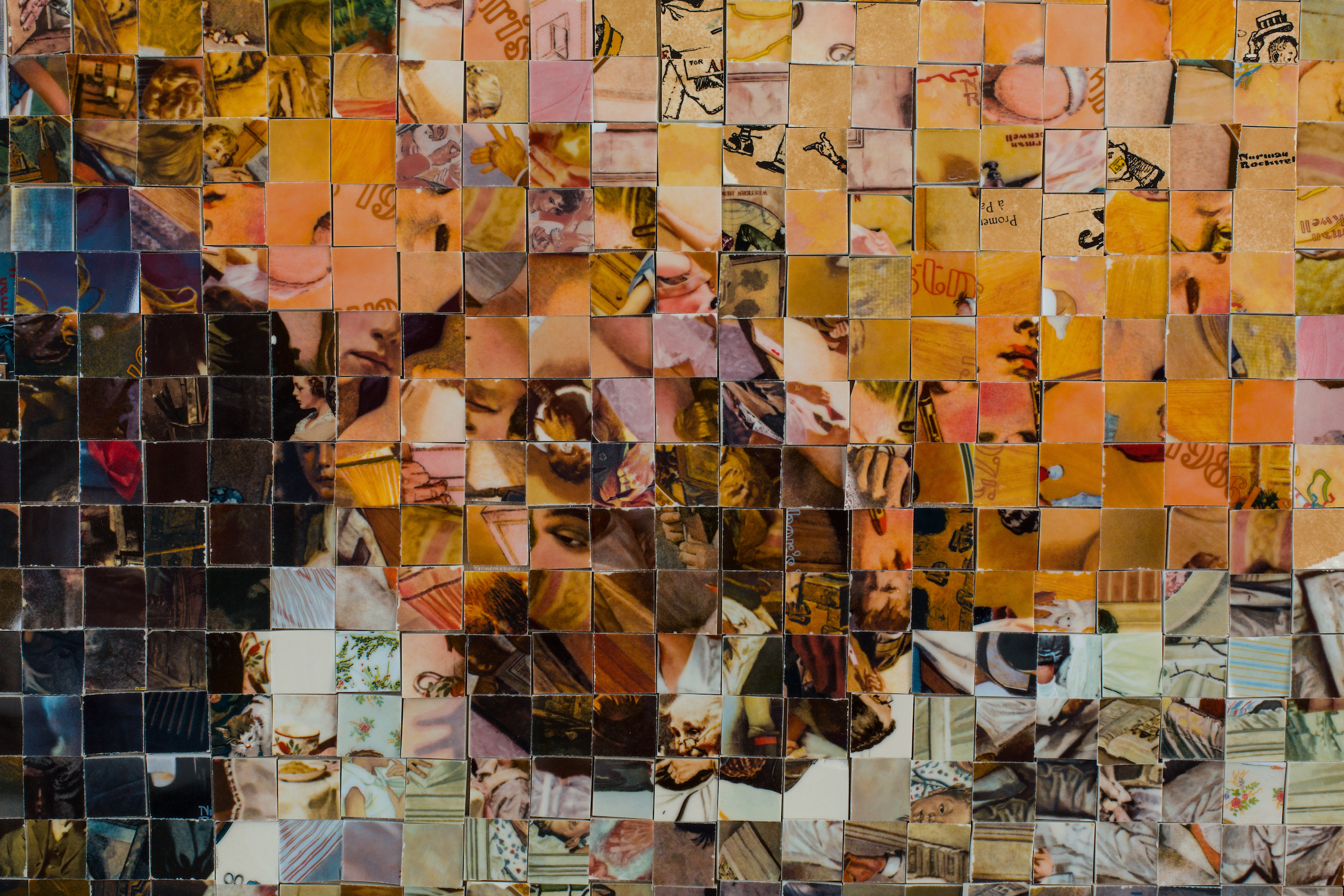
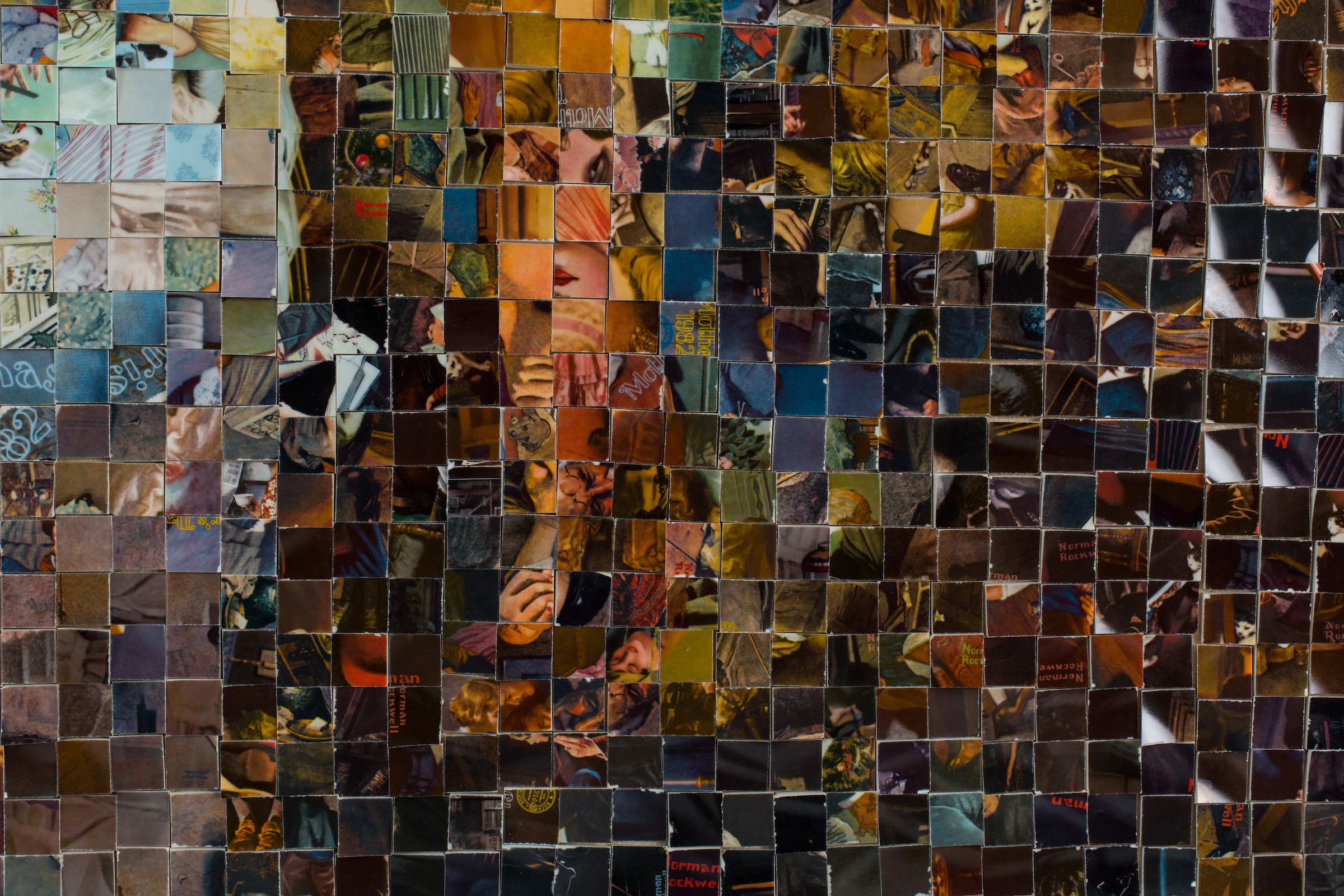
Fitting In With The Squares (Self-Portrait), Porcelain Norman Rockwell commemorative plates on wood, 67″x 47″, 2019
An Unscripted Chain of Events (timing)
The warm saccharine glow of Norman Rockwell’s imagery is burnished into the periphery of my childhood alongside my grandparents’ soft smiles and my parents’ simultaneous eye rolls. Winking coercively from pages of magazines and television advertisements, his illustrated armies of perfectly imperfect girls never resonated with me. I was generation Atari 2600.
Nearly thirty years later however, I relished finding Rockwell’s commemorative plates in thrift stores. In the hilarity and horror of discovering new Rockwellian vignettes, I admit to being awash in what I can best describe as feminist schadenfreude. No matter the collectors boxes, serial numbers or certificates of authenticity, these heirlooms weren’t making the generational cut- and thrift stores appeared to be struggling to move them for three dollars a piece.
Initially I took their second market failure as a glimmering sign of cultural progress, yet the sheer volume of plates available revealed the mark of indelible cultural relevance. Rebuffing the content of Rockwell’s images didn’t distance the persistence of its messaging in my life either. If anything it gave me a clearer understanding of how formative resistance can be. Sensing their value within the timeline of American material culture, and with no clear plan I began to collect. I figured I’d store them until I knew what to do.
Then Leonard Cohen died in early November 2016. The next evening our Electoral College selected the 45th president. Somewhere in the malaise of the days that followed I bought You Want it Darker and Cohen’s songs became a balm, a sacred auditory guide that ferried me across the swirling waves of despair I felt when the words “president-elect” and “Trump” were said in succession.

As weeks passed, the projects in my studio went from full color to black and white and then to black on black. I reverted into my sketchbook, and then pulled back from drawing to journaling. Soon I quit writing, finding solace in arranging shelves and combing through boxes.
While stacking and sorting, I came across an old photograph in a memory box. It was an accidental self-portrait; the kind you’d discover after printing a roll of film. The moment it captured took place in the late ’90s after an iron pour. I had just taken off my leathers. My fingers were still sooty with coke. A short time after this photo was taken, I’d withdraw from school, drop my classes and drive my ’92 VW Golf packed with everything I owned to California. I was halfway through my bachelor’s degree, in a relationship, surrounded by friends and family, yet I knew in order to become who I was meant to be I had to leave. I had met the path of self actualization.

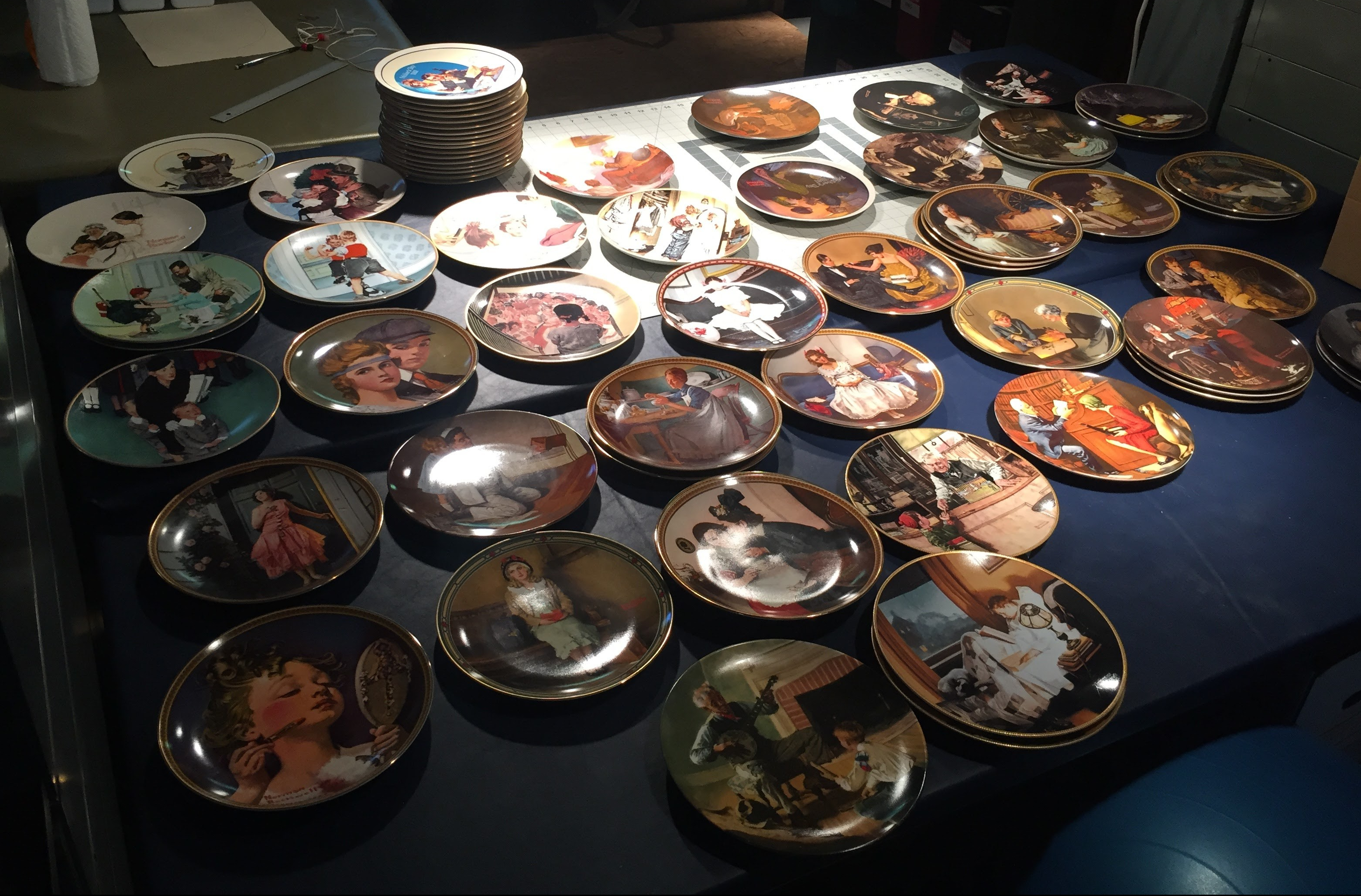
As I continued through the studio, it became clear that my habit of thrifting commemorative plates had gotten a little out of hand. Amassed slowly, a couple dollars at a time for over a decade, I now had few hundred Norman Rockwell plates. Mixed in with church fundraiser plates, Mother’s Day plates, an assortment of creepy toddlers, flora and fauna, idyllic American landscapes and state plates, their assortment was representative of what was on the shelves. Stacks of old white men interacting with school age white children, old white married couples nestled in domestic settings, middle aged white men happily doing chores, white women in the kitchen, white women nestled into furniture with pets, white couples enjoying leisurely activities, comfortable white families, safe white children, and happy white teenagers sat in piles on every available surface in the studio.
Seeing the collection together stung with uncanny relevance. Shining back at me was an America where father knew best, women knew their place and people of color were not part of the story. It was MAGA illustrated.
And then I understood. I saw the photograph take form out of pieces of the plates. Aesthetically they shared a color palette. They also resisted each other in a way that instinctually fit. I was going to insert myself in this narrative in a moment of my own becoming– a woman not to be sidelined, censured or cleaned up. In order to do this I’d have to again, break the frame.
Object Lesson (thoughts before sawing)
I like to imagine thrift stores as the last screen in a filtration system for valuables. They are where sentiment and surplus go to enjoy an unruly afterlife together. The meaning of an item orphaned from it’s original context may warp and twist in generational translations, relying upon a shopper’s point of reference to reestablish it’s purpose. Organization is dictated by shelf space. Grouped in color gradients (if you’re lucky) and seasonal themes (kinda), the whims of charity reign supreme when thrifting. A few steps up from the trash heap, thrift stores are one of my favorite places to sift for cultural signifiers and learn about material habits.
My criteria for loading a plate into the cart begins with if it makes me wonder why it exists in the first place. Dinner plates rarely make their way into the basket. They make sense. Decorative plates as a genre however, are truly curious. To take the most universal utilitarian object in the world, the very item we share our family recipes upon and render it a wall hanging glazed with materials deemed unsafe for food is both decadent and bizarre. Their function enters the realm of the symbolic.


Similar to the process art goes through before hanging on the walls of a gallery, imagery on commemorative plates is assumed to have undergone some form of vetting before being presented to the public. From what I’ve observed, images with the capacity to abate emotional insecurity, encourage a reliving of the past or ease anxieties of time passing are most desirable in this genre. The valuation of selected images accrues when they are glazed on fine porcelain, a material associated with class and heirlooms through the ages. Add mass production into the mix and these kitsch collectables are made accessible to millions. Their cultural metanarratives offer to supplant lived experiences with perfected archetypes, at times even employing anthropomorphism to do so. (See above.)
Many of the plates I picked up came in original boxes with certificates of authenticity and at least one brochure promising a high second market value. Averaging $20 each in the late 1970s (equivalent to about $80 now) it is easy to see why these assurances were crucial to their popularity. Made in limited editions (though often numbering in the thousands), commemorative plate campaigns framed the customer experience as akin to being a member in an exclusive club. These clubs were highly popular. From the late 1970s through the mid-1980s, collector plates enjoyed one of the longest running speculative markets of any modern-day collectible. The bubble burst in the late 1980s.


The largest cohort of collectors to purchase commemorative plates during the last quarter of the twentieth century belonged to the Great Generation. This group of consumers grew up on limited means during the Great Depression, experienced World War II as young adults and retired from the working class having achieved higher levels of material comfort than previous generations. Noted for their rubber band balls, hoarding of used tools and scraps of cloth, they bought commemorative plates as investment pieces.
By the mid-1970s, with decades of his ad work being reproduced on commemorative plates, Norman Rockwell’s career spanned over a half century. Championed the “Painter of American Life”, Rockwell was a technically gifted commercial illustrator and a household name. Enlisting neighbors and young children he approached in school yards to model, Rockwell crafted narratives of everyday working class white American life during the Jim Crow era. This was the audience his advertisers and publishers targeted, and he catered to their wishes. Beginning in the early 1960s Rockwell’s works included imagery sympathetic to the Civil Rights movement, however those works were not the selected for commemoration. Instead, one decade after the Civil Rights Act became law, a decade remembered for strides made women’s rights, the end of the Vietnam War and acute civil unrest, plate manufacturers chose to commemorate selections of Rockwell’s imagery that served to reify traditional gender power dynamics and placate white fears within an ever changing American cultural landscape.


As Rockwell’s imagery shifted from advertisement to commemorative, the original commercial purpose for his illustration faded into the background. Consider the example above. While both presentations are designed to invoke desire, the consumer experiences of the ad and the plate are nuanced and quite different. In 1920, The Melody of Music and the Melody of Light (At the Piano) asked the public to envision future evenings with friends improving with the addition of Mazda Edison light bulbs. In 1984, Close Harmony encouraged a nostalgic reminiscence of evenings in the past spent with friends and family. The lightbulbs become a tertiary concern, if that. Assembled into cohesive thematic series, often across a mishmash of periods in Rockwell’s career, Simpler Times, American Heritage, Rediscovering Women and other plate lines, provided a platform for his illustrations to exist without the trappings of their history.
Finding these plates in large numbers at thrift stores underscored their failure as heirloom momentos. However in the aftermath of the 2016 presidential election, with white nationalism on the rise and restrictions on women’s physical autonomy ratcheting up, it was as if their messaging had found new hosts. The indelibility of their messages had spread across the Twittersphere, and was being shouted by talking heads on various media platforms. These plates no longer appeared to be relics of the past fulfilling an aging generation’s need to self soothe. This America, untethered from the social niceties of Rockwell’s era, was in power again.
Process (part to whole)
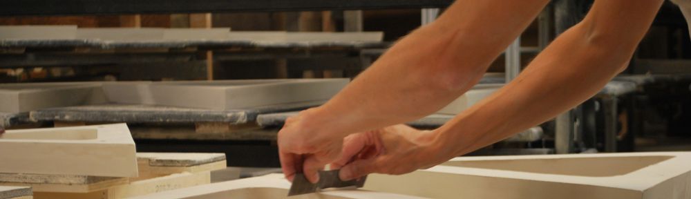
My set up in the studio included a tile saw, an assortment of tile and glass blades and piles of plates. I fashioned a jig out of scrap plywood and bolted down a piece of leftover plexiglass on top to help keep it dry. (A year into cutting, this jig disintegrated and I upgraded to a plastic square. -Tip for future plate cutters: Go plastic!)
 I worked in an assembly line fashion my ancestors who worked in factories would’ve appreciated. Staring each session with a stack of ten plates, I ran them through the various stages of cutting as a group to save time on changing blades. I’d begin by cutting the stack of plates into strips with a glass blade. Then I’d change to a tile blade to rough cut the feet off the back of the strips. Switching back to the glass blade, I’d finish by trimming the strips down to squares. Glass blades while slow going through porcelain prevented the imagery from chipping, as did guiding them through the saw bed face up.
Ten plates took five hours to process from start to finish, and yielded 300 squares. Ultimately I’d end up cutting 9000 to get the 2400 of the right color I needed. In the warm months, I’d take breaks when the tile saw’s water tray needed to be refilled. In the winter, I’d fill the tray with warm water and work until it got cold.


As the plates became strips and the strips became squares, elements in the illustrations I hadn’t noticed before came into focus. Rockwell’s tightly constructed narratives became fragmentary abstractions. The visual boundaries he created by placing a figure or an object in the foreground ground stopping a viewer from entering the image were gone. The single gesture of a hand, the expression on a face, the tonal mood set in foreground and backgrounds all retained the mark of his hand, but the elements were freed. A one inch format maintained a light curvature from the plates, making the material recognizable, referential and familiar.
Unlike the measurable hours of sitting on a stool cutting, days spent sorting the squares into color palettes took on their own rhythm. Breaks happened when my coffee cup ran dry, a podcast wrapped up or my feet gave out. My Mom and my friend Kayle jumped in periodically to help out. It was like doing math with color, adding certain squares to a group here or moving them over to a tray there, but as there were no right answers, achieving a mental space of not thinking too much, but just enough, was part of the practice.


The work surface for laying out the pattern consisted of two tables butted up against each other in the studio, taped off in a grid. This set up was the easiest to edit the pattern from, as I wouldn’t have to fight gravity or mess with sticky tack while working. It also meant I would be building the image on a horizontal plane, not the vertical one it was intended to be shown on. Also, due to the size of the space I had to work in, I could only get six feet away from it in any direction. The solution in testing tonal blends relied on using two techniques: taking photos with my phone from above and sliding my glasses down my nose to see if the colors blurred together right.


Between cutting plates, sorting tile and laying out the pattern, I spent eighteen months building the portrait. It was the longest duration I’d ever spent on a single piece. It was also my first self-portrait. In the beginning I questioned whether this was the right image to bring forward. As someone who works with iconography, I wondered what would happen if I strayed into personal territory. Would I make myself a target? Did I want to discuss my perspective from a personal vantage point? At a certain point, I just trusted the impetus guiding me. There would be time for other art, but this piece needed to happen now.
So it was with this portrait consuming nearly all my work space that I navigated the first chapters of what it is to live under a Trump/Pence administration. I took breaks to sand an AR-15 down to dust as a meditation on mortality, and to wrap hair around a section of fencing from New Mexico while contemplating the human systems used to dehumanize refugees. A few commissions came in and craft sale seasons too. After each intermission I’d return to her, and each time the portrait provided new challenges, both in its technical needs and the reflective personal work it offered.
Through this process numerous pathways of understanding both the cultural value of the materials and the personal underpinnings of the image became clearer to me. The experience slowly revealed the formative and persistent role of resistance and resilience on a woman in American society.
I came to understand the woman in this portrait to be so much like the young women I’ve worked with. I see in her shades of my mother, who raised me an era she had helped fight to secure. I see a woman with greater agency over her life than her foremothers. I see a woman who knows what to take from life, what to leave and how to build a life out of the pieces that fit.
Fitting In With The Squares (Self-Portrait), Porcelain Norman Rockwell commemorative plates on wood, 67″x 47″, 2019
detail
detail
Fitting in with the Squares (Self-Portrait) is on view:
April 6th, 2019- June 5th, 2019- MKE Influencers, Var Gallery West in Milwaukee, Wisconsin
July 13th, 2019- January 2020- Earth Piece, Everson Art Museum, Syracuse, New York


 MAKING HILLS & VALLEYS:

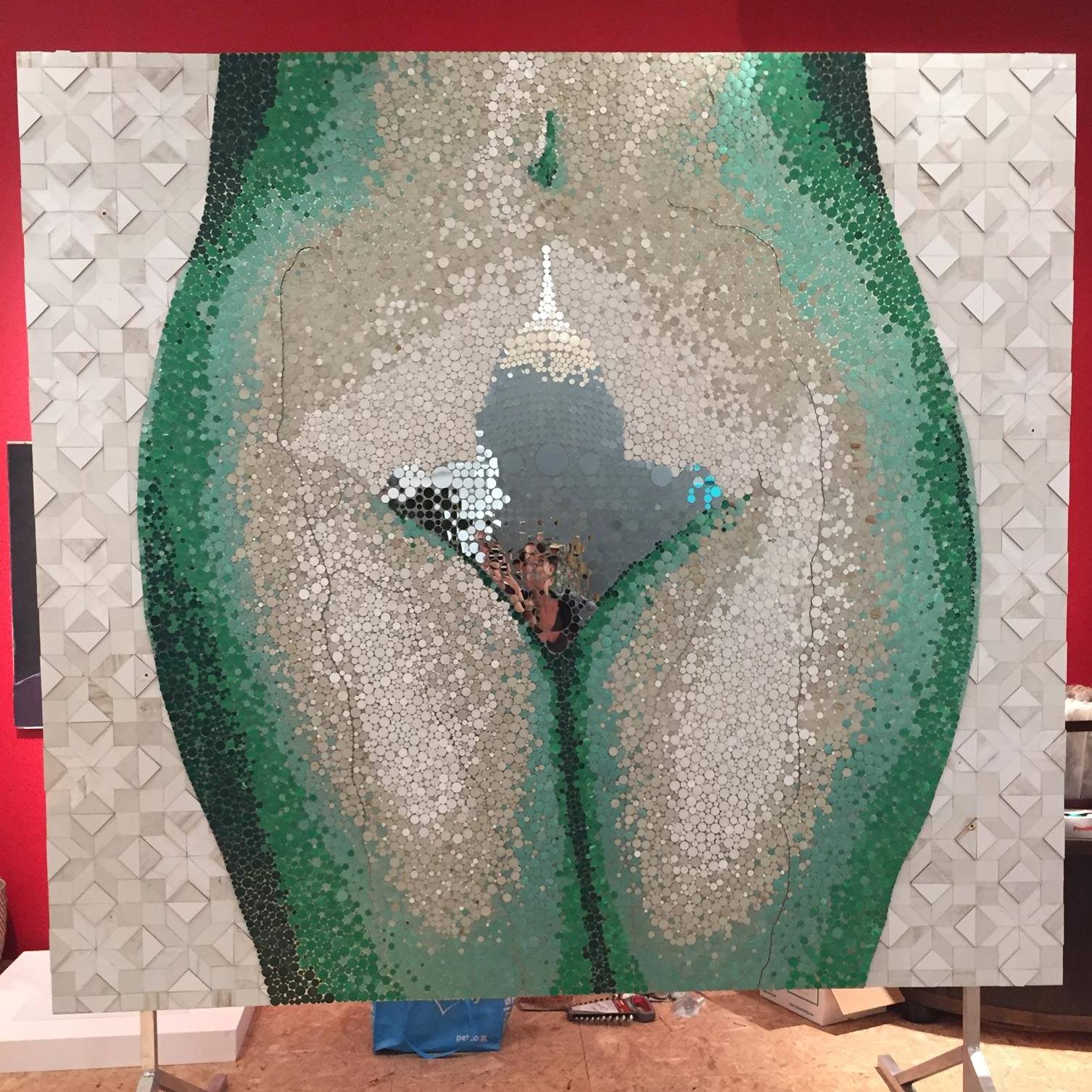 During the making of Hills & Valleys, aluminum signs from defunded Planned Parenthood health centers in Wisconsin were carefully deconstructed, repurposing nearly every square inch of the signs into the artwork. Hills & Valleys unites these reimagined materials to create a large scale sculptural image of the hips, groin and thighs of a woman. Atop her pubic mound is a mirrored vajazzle of our nation’s capitol.


